![]()
Donec efficitur, ligula ut lacinia
viverra, lorem lacus.
![]()
Donec efficitur, ligula ut lacinia
viverra, lorem lacus.
Ever found yourself staring at the ocean, completely mesmerized by its ever-changing colors? Whether it’s the deep blues of a stormy sea or the soft turquoise of a tropical lagoon, the ocean is a masterclass in color harmony. And guess what? You don’t need to be a professional designer to steal its magic. Today, we’re diving into 17 stunning color palettes inspired by the ocean—perfect for everything from home decor to branding projects. So grab your virtual snorkel, because we’re about to explore some seriously gorgeous hues.
Why ocean-inspired palettes? Well, aside from being universally appealing (who doesn’t love the beach?), these colors evoke calm, depth, and a touch of adventure. Plus, they’re versatile enough to work in any setting. Whether you’re revamping your living room or designing a logo for your surf shop, these palettes will give you that effortless coastal vibe. Ready to make a splash? Let’s dive in.
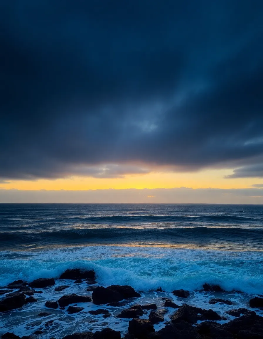
You know that rich, inky blue you see when the ocean reaches its deepest points? That’s what we’re channeling here. This palette is all about sophistication—think navy, cobalt, and a touch of midnight. It’s perfect for creating a moody, elegant atmosphere. I once used this combo for a client’s branding, and let’s just say they got more compliments than a free donut stand.
Pair it with crisp whites or soft grays to keep it from feeling too heavy. Or, if you’re feeling bold, throw in a pop of coral for a playful contrast. Trust me, this palette is like the little black dress of color schemes—timeless and always in style.
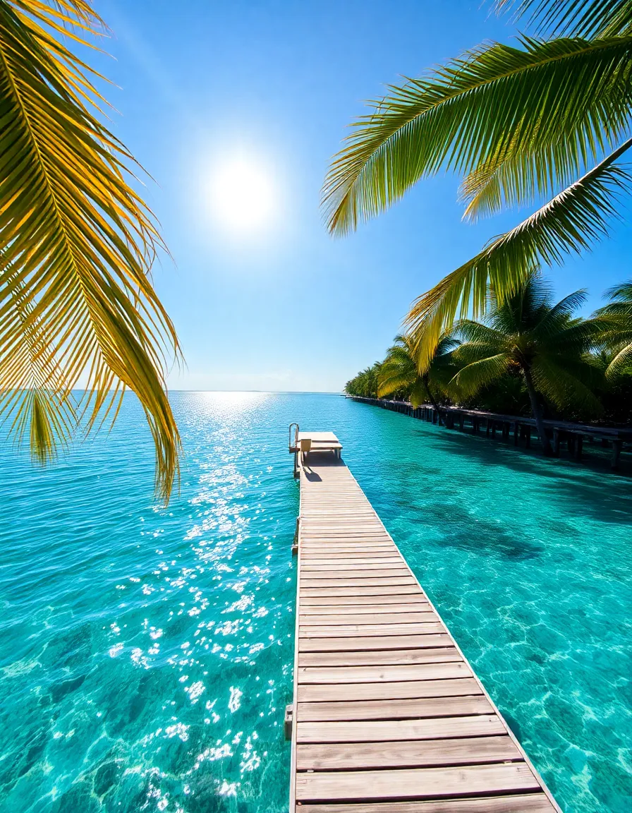
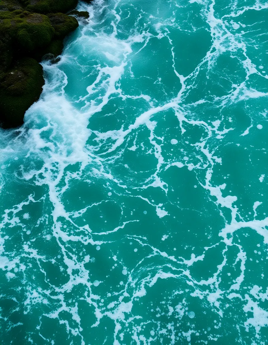
Close your eyes and imagine the clearest, most inviting water you’ve ever seen. That’s tropical turquoise for you—bright, refreshing, and impossible to ignore. This palette is all about fun and energy, with shades that scream vacation vibes. I mean, who wouldn’t want their living room to feel like a beachfront cabana?
Mix in some sandy beige and seafoam green to balance the brightness. And if you’re feeling extra, a dash of hot pink or sunny yellow can take it from “nice” to “where’s my piña colada?” levels of awesome.
Not all ocean palettes are sunshine and rainbows. Sometimes, you want that brooding, dramatic energy of a stormy sea. This palette leans into deep grays, slate blues, and even a touch of black. It’s moody, it’s intense, and it’s perfect for creating a space that feels like the opening scene of an epic movie.
I used this combo in my home office, and now I feel like a mysterious sea captain plotting my next adventure (or, you know, answering emails). Add some metallic accents—like silver or brushed nickel—to keep it from feeling too dark.
Let’s take a break from the drama and embrace the calming neutrals of a sandy beach. This palette is all about warmth and relaxation, with creamy beiges, soft taupes, and whisper-light grays. It’s like a deep breath in color form—ideal for bedrooms or spaces where you want to unwind.
Pair it with driftwood textures and linen fabrics to amplify the cozy factor. And if you’re worried it might feel too bland, a hint of sage green or pale blue can add just enough interest without ruining the zen.
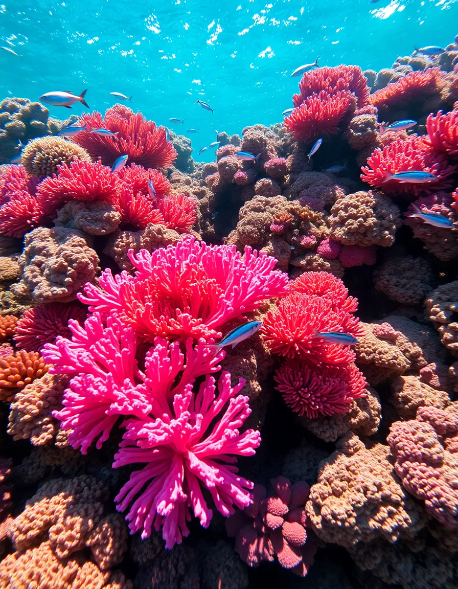
If you’re the type who loves color (and lots of it), this palette is for you. Inspired by vibrant coral reefs, it’s a riot of pinks, oranges, and teals. It’s playful, energetic, and guaranteed to put a smile on your face. I once painted an accent wall in this scheme, and now it’s the most Instagrammed spot in my house.
Balance the brightness with plenty of white space or neutral furniture. And don’t be afraid to mix patterns—stripes, florals, and geometric prints all play nicely in this happy chaos.
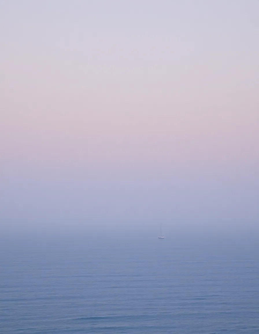
Ever seen the ocean early in the morning, when the mist rolls in and everything feels soft and dreamy? That’s the vibe here. This palette is all about muted blues, lavenders, and foggy grays. It’s ethereal and romantic—perfect for creating a space that feels like a whispered secret.
Layer in sheer fabrics and matte finishes to enhance the hazy effect. And if you want to add a touch of magic, a few metallic accents (think mercury glass or brushed gold) can make it feel downright enchanted.
For those who love a cooler, crisper aesthetic, this palette is a dream. Think glacial blues, frosty whites, and the barest hint of silver. It’s clean, modern, and just a little bit icy (in the best way possible). I used this in a bathroom redesign, and now it feels like a spa—minus the overpriced towels.
Keep the lines sharp and the textures smooth to match the palette’s sleek vibe. And if you’re worried it might feel too cold, a touch of pale wood or woven rattan can add warmth without clashing.

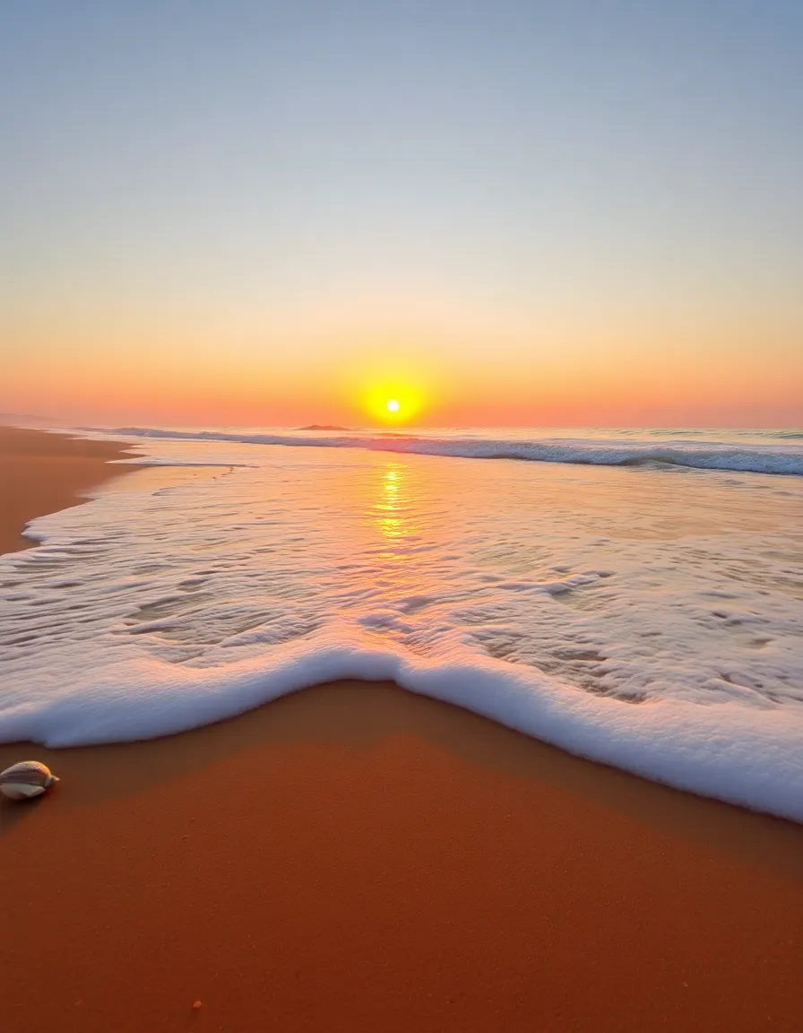
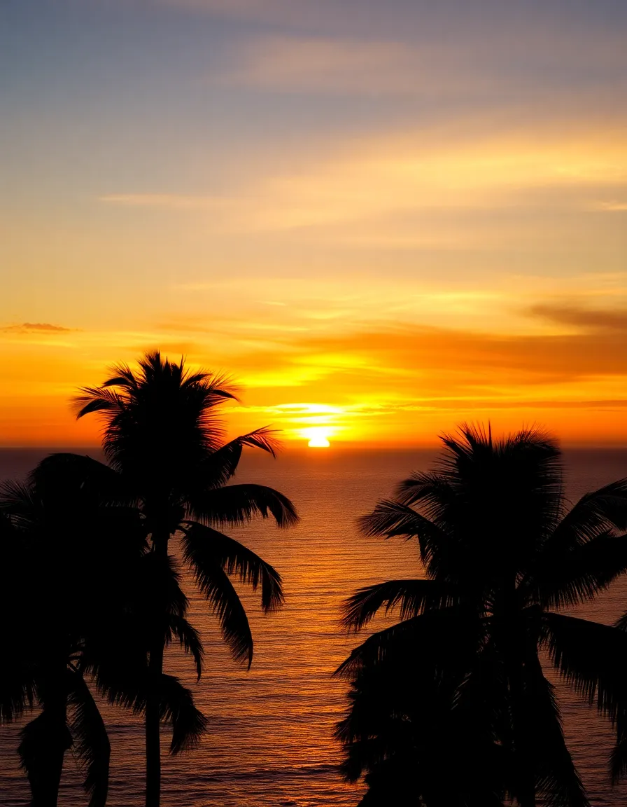
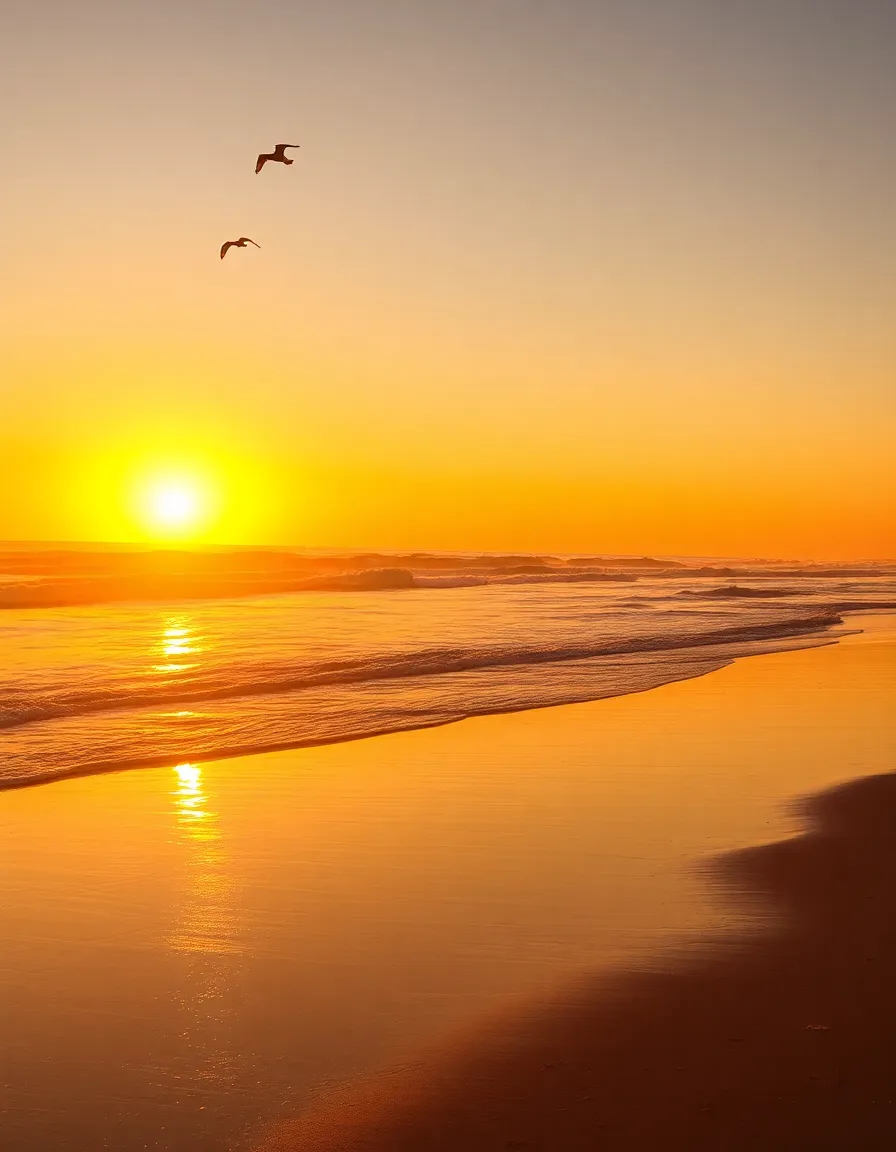
Sunset at the beach is basically nature showing off, and this palette captures every glorious moment. We’re talking fiery oranges, soft pinks, and golden yellows—all melting into each other like a watercolor painting. It’s warm, inviting, and full of energy.
Use this palette in spaces where you want to encourage conversation, like dining rooms or living areas. And don’t shy away from mixing textures—velvet, brass, and terracotta all play beautifully with these hues.
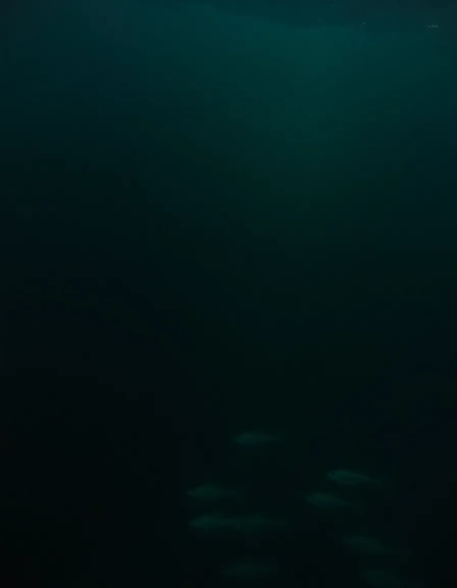
Darker than the classic deep blue, this palette dives into the abyss with near-black greens, inky purples, and shadowy teals. It’s moody, mysterious, and perfect for creating a space that feels like a hidden underwater cave (but, you know, with better Wi-Fi).
Add some biophilic elements—like a living wall or a fish tank—to enhance the aquatic vibe. And for a touch of drama, backlighting or LED strips can make the colors feel even more immersive.
Light, airy, and effortlessly chic—this palette is all about those soft seafoam greens and whisper-blue tones. It’s like a breath of fresh air in color form, perfect for small spaces or rooms that need a little lift. I painted my kitchen cabinets this color, and now my morning coffee tastes better (placebo effect? Maybe. Do I care? Nope.).
Pair it with lots of natural light and minimalist decor to keep the vibe breezy. And if you want to add depth, a few darker wood accents can ground the palette without weighing it down.
Sometimes, less is more—and this palette proves it. Sticking to variations of navy blue creates a sleek, cohesive look that’s both timeless and modern. It’s like the ocean on a calm night: deep, serene, and full of quiet power.
Play with different textures—think velvet, linen, and glossy finishes—to keep things interesting. And if you’re feeling daring, a single pop of white or gold can make the whole scheme sing.
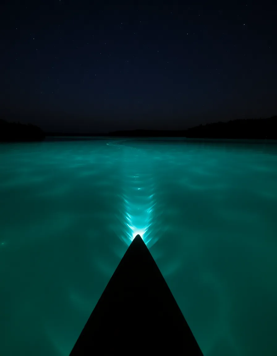
Ever seen photos of those magical beaches where the water glows blue at night? That’s the inspiration here. This palette mixes electric blues, neon greens, and deep purples for a look that’s straight out of a sci-fi movie. It’s bold, unexpected, and guaranteed to turn heads.
This one’s best in small doses—think accent walls, artwork, or statement furniture. And for maximum impact, pair it with black or charcoal to make the colors really pop.
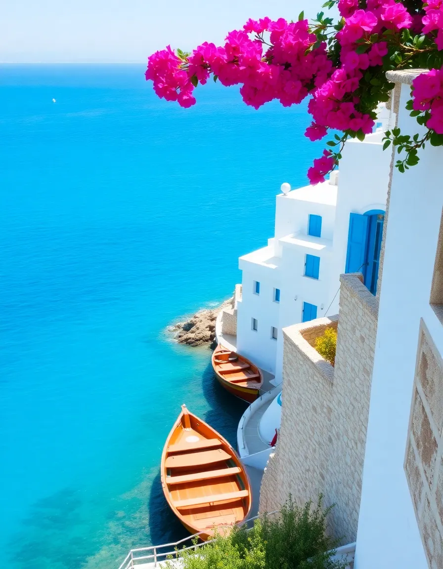
Picture the sun-drenched coasts of Greece or Italy, where the water is an impossible shade of cerulean and the buildings are blindingly white. That’s the vibe we’re going for here. This palette is bright, cheerful, and full of vacation energy.
Whitewash everything (seriously, the more white, the better) and add in those iconic blue shutters or tile details. A few terracotta accents can warm things up without dulling the brightness.
Move over, blue—this palette is all about the ocean’s green side. Think emerald, jade, and deep teal, with a touch of stormy gray. It’s lush, moody, and perfect for creating a space that feels like an underwater forest.
Pair it with natural materials like wood and stone to enhance the organic vibe. And if you’re worried it might feel too dark, a few metallic gold accents can add just the right amount of sparkle.
This palette is all about warmth, with golden yellows, amber, and rich caramel tones. It’s like the ocean at sunset, when the light turns everything to gold. Cozy, inviting, and full of positive energy, it’s perfect for spaces where you want to feel instantly at ease.
Layer in plenty of natural textures—jute rugs, woven baskets, and wooden furniture—to complete the look. And if you’re feeling extra, a few navy or olive green accents can add depth without killing the vibe.
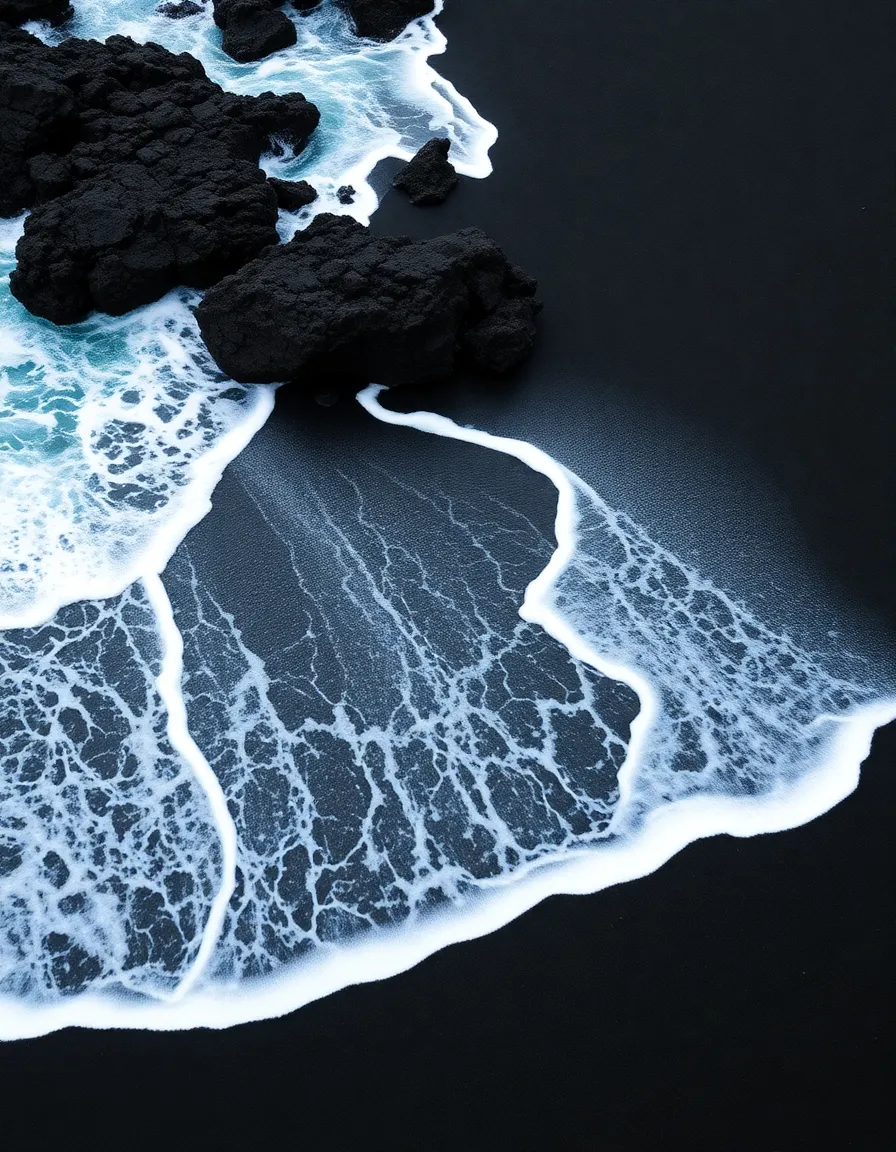
Forget white sand beaches—this palette is inspired by the striking contrast of black sand against turquoise water. It’s bold, modern, and full of edge, with deep blacks, charcoal grays, and vivid aqua accents.
Keep the base neutral (think black or dark gray walls) and let the brighter blues steal the show. And for a touch of luxury, add in some metallic silver or chrome details.
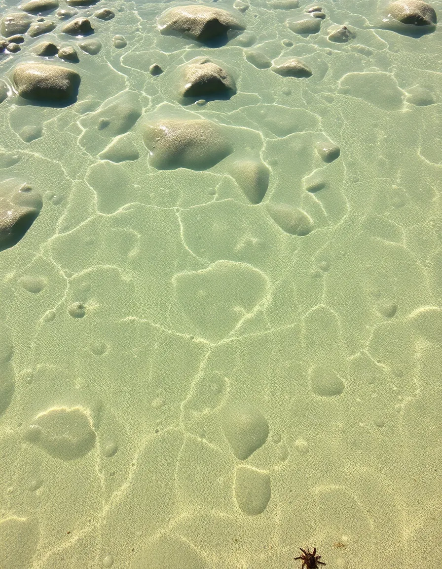
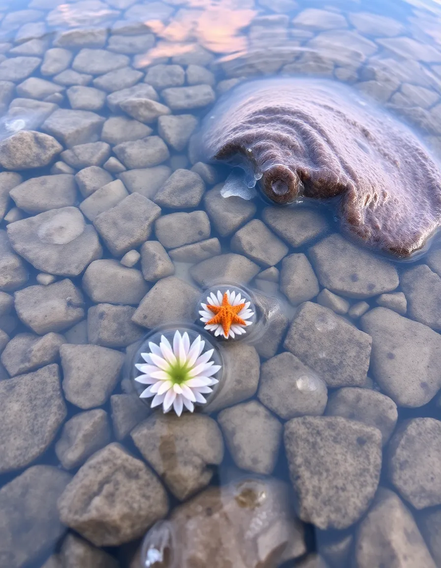
Soft, sweet, and utterly charming—this palette is inspired by the delicate colors of tide pools. Think blush pinks, baby blues, and the palest lavender. It’s whimsical, dreamy, and perfect for nurseries, bathrooms, or anywhere you want a touch of fairy-tale magic.
Pair it with vintage-inspired decor—think scalloped edges, floral prints, and distressed wood—to enhance the nostalgic vibe. And don’t be afraid to mix in a few metallic accents for a little sparkle.
And there you have it—17 ocean-inspired color palettes to transform any space into a coastal dream. Whether you’re into moody blues or cheerful corals, there’s something here for every taste. So go ahead, take the plunge and let the ocean’s beauty inspire your next project. Who knows? You might just find yourself feeling a little more relaxed, a little more creative, and maybe even craving a beach day. (You’re welcome.)
Now, over to you—which palette speaks to your inner mermaid or sea captain? Drop your favorites in the comments, and let’s keep the ocean vibes flowing. Until next time, keep making waves! 🌊